Challenge: As Simone expanded, the company’s identity extended to new sub-brands within its portfolio of properties that over time began to feel unrelated to the parent brand. The visual look and verbal style became diluted and varied, as did Simone’s proposition.
Solution: Execute Simone’s first-ever brand refresh, uniting the parent company and its sub-brands by creating one clear articulation. To achieve this the client's voice needed to be defined and new content written across digital, print, and social. Guidelines were updated with contemporary fonts, and the introduction of support elements like texture backgrounds created a consistent look across all touchpoints. Templates for print ads, journal ads, sell sheets, and presentations were designed, and a responsive website was launched to promote Simone in a modern marketing landscape.
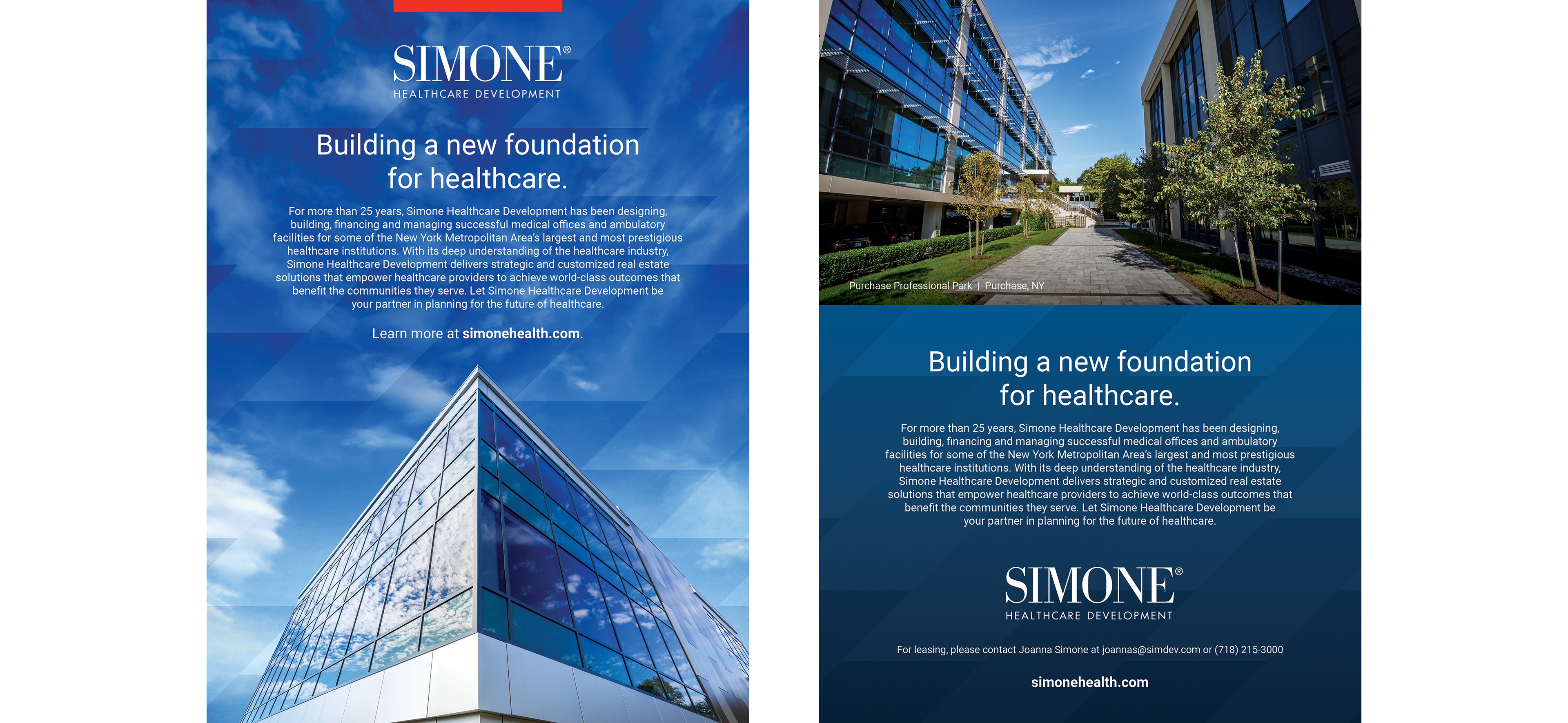
Simone Healthcare Development Print Advertising
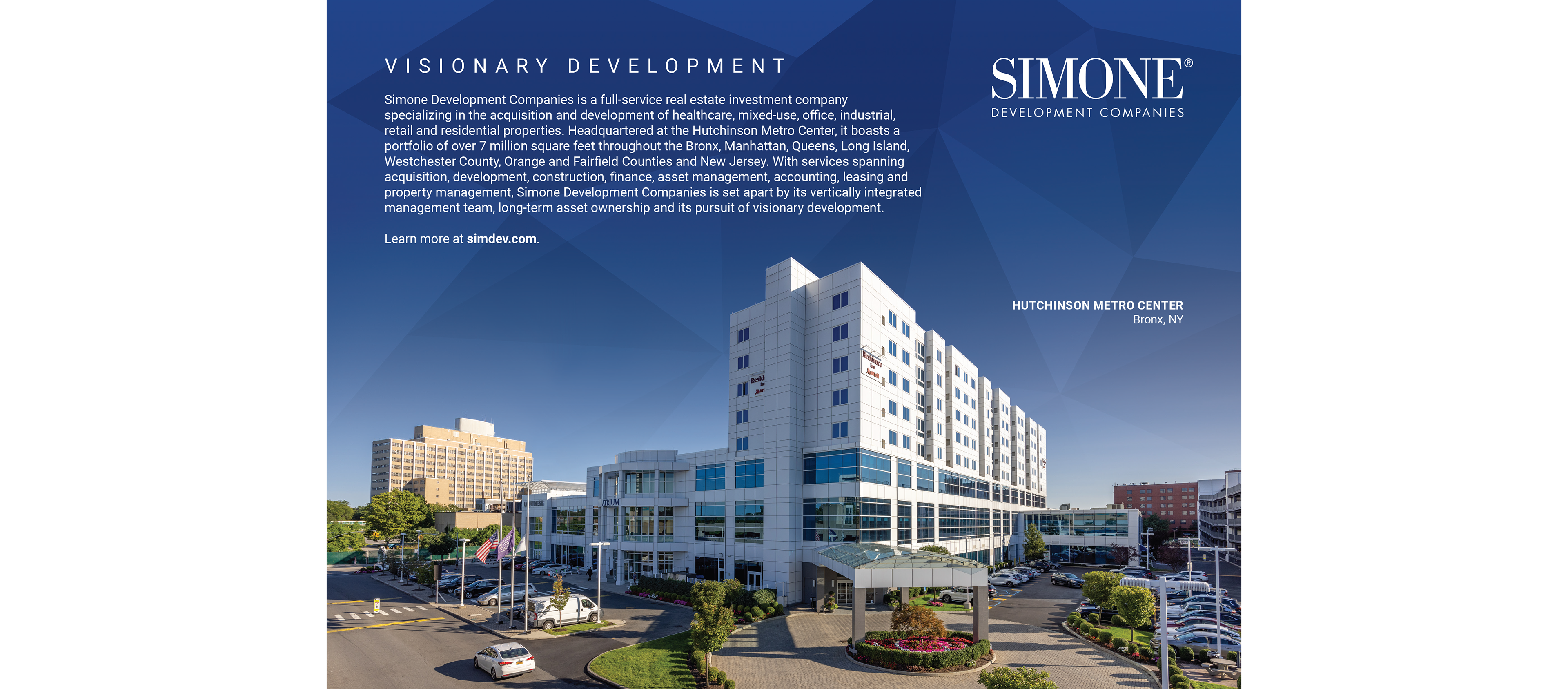

Simone Development Companies Print Advertising

Simone Development Companies Journal Ads
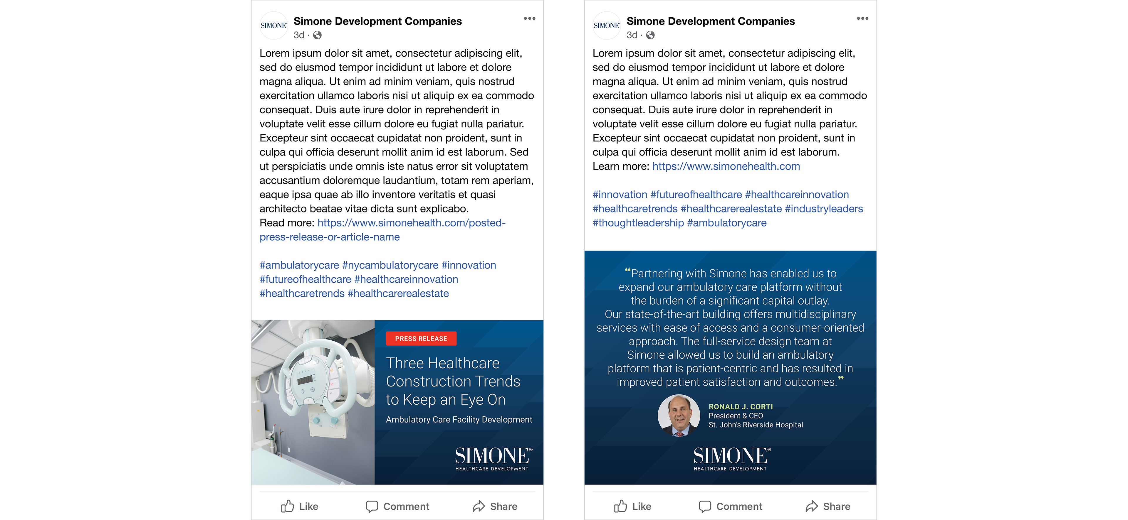
Social Post Templates
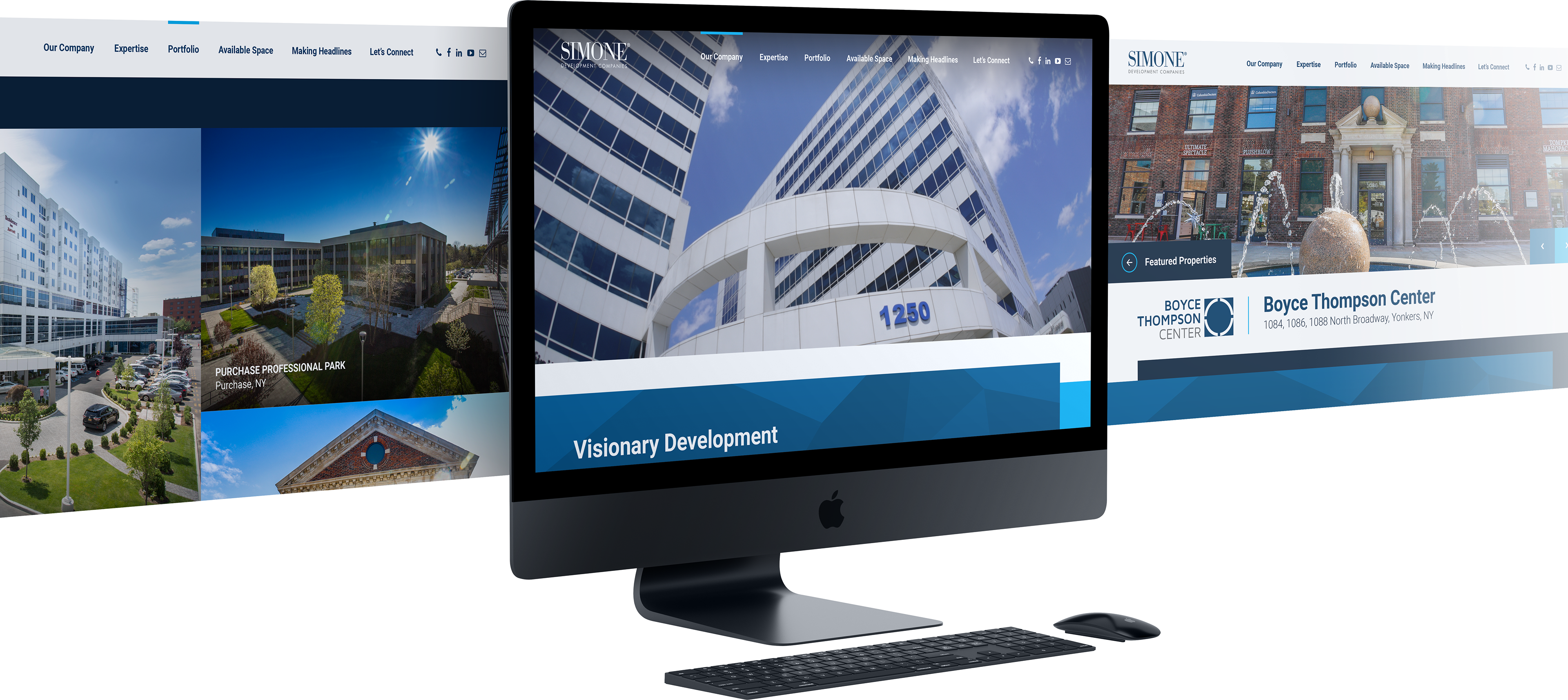
Responsive Website